By the end of this chapter, you should be able to:
Create basic scatterplots using ggplot2
Map variables to aesthetics (color, size, shape)
Use different geoms (points, smooth lines, histograms)
Create facets to display subsets of data
Customize plots for clear communication
3.2 Introduction to Data Visualization
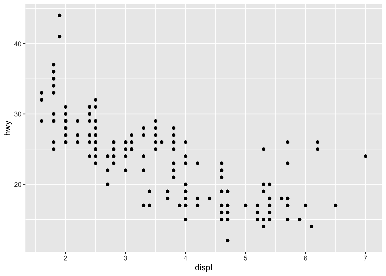
This week we begin with visualization first, following R for Data Science (Ch. 2). ggplot2 is part of the tidyverse and implements the grammar of graphics.
We will use the built-in mpg dataset for examples.
You can add labels, titles, and themes to improve clarity.
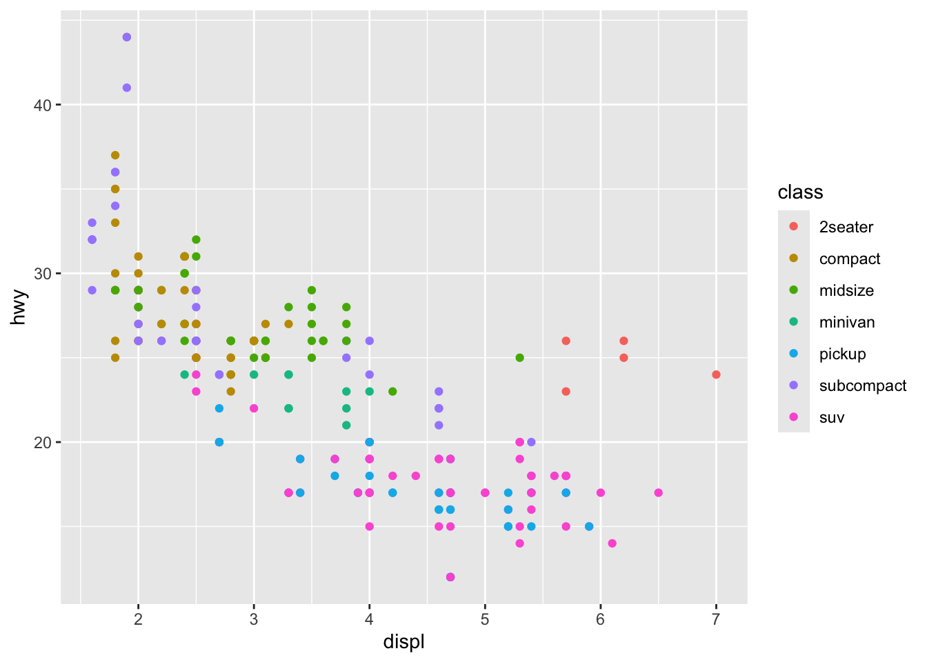
ggplot(data =mpg)+geom_point(mapping =aes(x =displ, y =hwy, color =class))+labs( title ="Fuel Efficiency by Engine Size", x ="Engine Displacement (L)", y ="Highway MPG", color ="Car Class")+theme_minimal()
3.7 In-Class Challenge
Using the mpg dataset:
Make a scatterplot of displ vs hwy.
Map a third variable to color.
Add a smooth line and facet by drive type.
Add labels and use a clean theme.
3.8 Homework Preview
For Homework, you will:
Use the mpg dataset (or another dataset of your choice).
Create three plots:
A scatterplot with at least one aesthetic mapping
A faceted plot showing subsets of data
A customized plot with titles, labels, and a theme
Render your .qmd to PDF and submit on Canvas.
3.9 Next Steps
Next week, we begin data transformation using dplyr to manipulate data before plotting.
Source Code
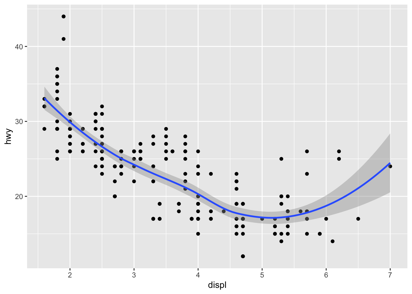
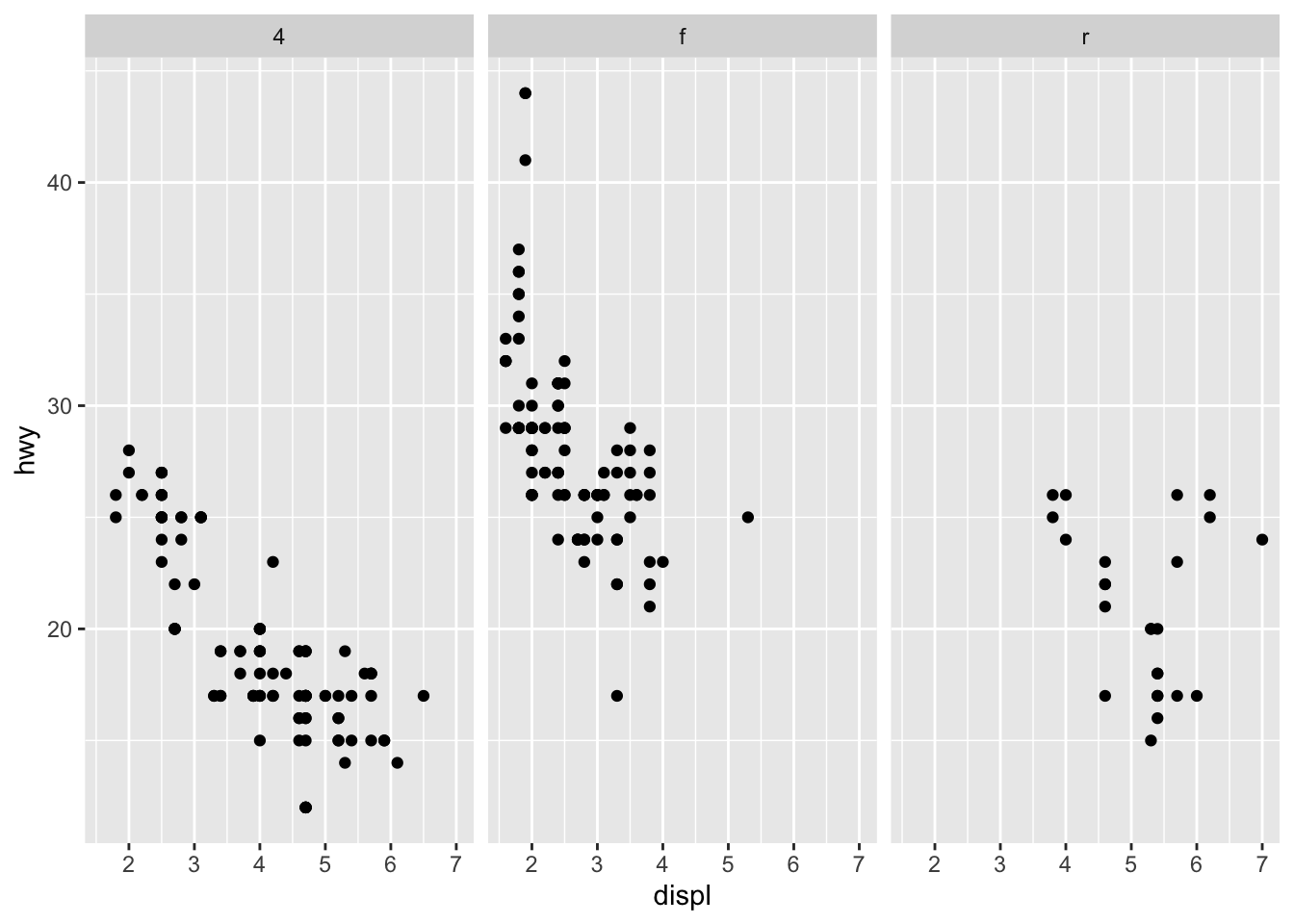
---title: "Data Visualization with ggplot2"---## Learning ObjectivesBy the end of this chapter, you should be able to:- Create basic scatterplots using `ggplot2`- Map variables to aesthetics (color, size, shape)- Use different geoms (points, smooth lines, histograms)- Create facets to display subsets of data- Customize plots for clear communication------------------------------------------------------------------------## Introduction to Data VisualizationThis week we begin with **visualization first**, following *R for Data Science (Ch. 2)*.\`ggplot2` is part of the tidyverse and implements the **grammar of graphics**.\We will use the built-in `mpg` dataset for examples.------------------------------------------------------------------------## ggplot2 BasicsThe **template** for a ggplot is:``` rggplot(data =<DATA>) +<GEOM_FUNCTION>(mapping =aes(<MAPPINGS>))```### Example: Scatterplot of engine size vs. highway mpg```{r}library(tidyverse)ggplot(data = mpg) +geom_point(mapping =aes(x = displ, y = hwy))```------------------------------------------------------------------------### In-Class Exercise 11. Create a scatterplot of `cty` (city mpg) vs. `hwy` (highway mpg).\2. What relationship do you see?\3. Try swapping x and y—does it change the interpretation?------------------------------------------------------------------------### Aesthetic MappingsYou can map variables to visual properties: color, size, shape, alpha.### Example: Color by class```{r}ggplot(data = mpg) +geom_point(mapping =aes(x = displ, y = hwy, color = class))```------------------------------------------------------------------------### In-Class Exercise 2- Modify the plot to map `size` to `cyl` (number of cylinders).\- Map `shape` to `drv` (drive type).\- Try using both color and shape in one plot.------------------------------------------------------------------------## Adding GeomsThe `geom_point()` function creates a scatterplot, but there are many geoms.### Example: Add a smoothing line```{r}ggplot(data = mpg) +geom_point(mapping =aes(x = displ, y = hwy)) +geom_smooth(mapping =aes(x = displ, y = hwy))```------------------------------------------------------------------------### In-Class Exercise 3- Add a `geom_smooth()` line to your plot from Exercise 1.\- Try setting `se = FALSE` to remove the confidence band.\- Change the color of the line manually.------------------------------------------------------------------------## FacetsFacets split the data into subplots based on a variable.### Example: Facet by drive type```{r}ggplot(data = mpg) +geom_point(mapping =aes(x = displ, y = hwy)) +facet_wrap(~ drv)```------------------------------------------------------------------------### In-Class Exercise 4- Use `facet_wrap()` to facet the plot by `class`.\- Try `facet_grid(drv ~ cyl)`—what do you observe?------------------------------------------------------------------------## Customizing PlotsYou can add labels, titles, and themes to improve clarity.```{r}ggplot(data = mpg) +geom_point(mapping =aes(x = displ, y = hwy, color = class)) +labs(title ="Fuel Efficiency by Engine Size",x ="Engine Displacement (L)",y ="Highway MPG",color ="Car Class" ) +theme_minimal()```------------------------------------------------------------------------## In-Class ChallengeUsing the `mpg` dataset:1. Make a scatterplot of `displ` vs `hwy`.\2. Map a third variable to `color`.\3. Add a smooth line and facet by drive type.\4. Add labels and use a clean theme.------------------------------------------------------------------------## Homework PreviewFor **Homework**, you will:- Use the `mpg` dataset (or another dataset of your choice).\- Create **three plots**: 1. A scatterplot with at least one aesthetic mapping 2. A faceted plot showing subsets of data 3. A customized plot with titles, labels, and a theme- Render your `.qmd` to PDF and submit on Canvas.------------------------------------------------------------------------## Next StepsNext week, we begin **data transformation** using `dplyr` to manipulate data before plotting.