Learning Objectives
By the end of this chapter, you should be able to:
- Understand the purpose of exploratory data analysis (EDA)
- Visualize distributions of single variables
- Examine relationships between variables
- Detect patterns, clusters, and outliers
- Use transformations to clarify patterns
Introduction to EDA
Exploratory Data Analysis (EDA) is about looking at your data to find patterns, spot anomalies, and guide your next steps.
We use ggplot2 to visualize both univariate and bivariate relationships.
We will use the diamonds dataset.
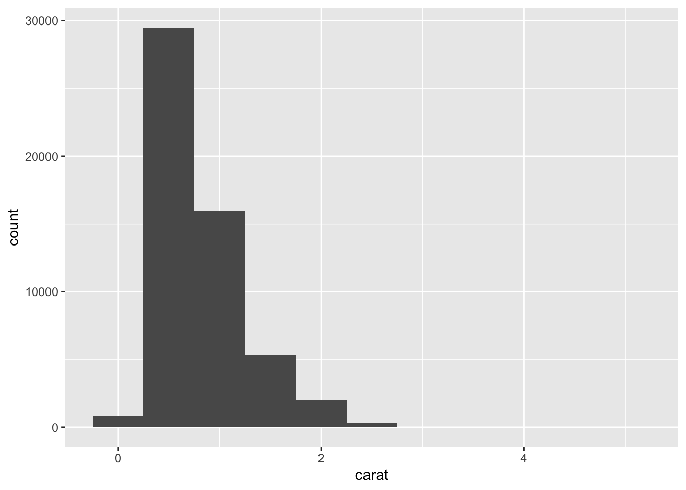
Visualizing Single Variables
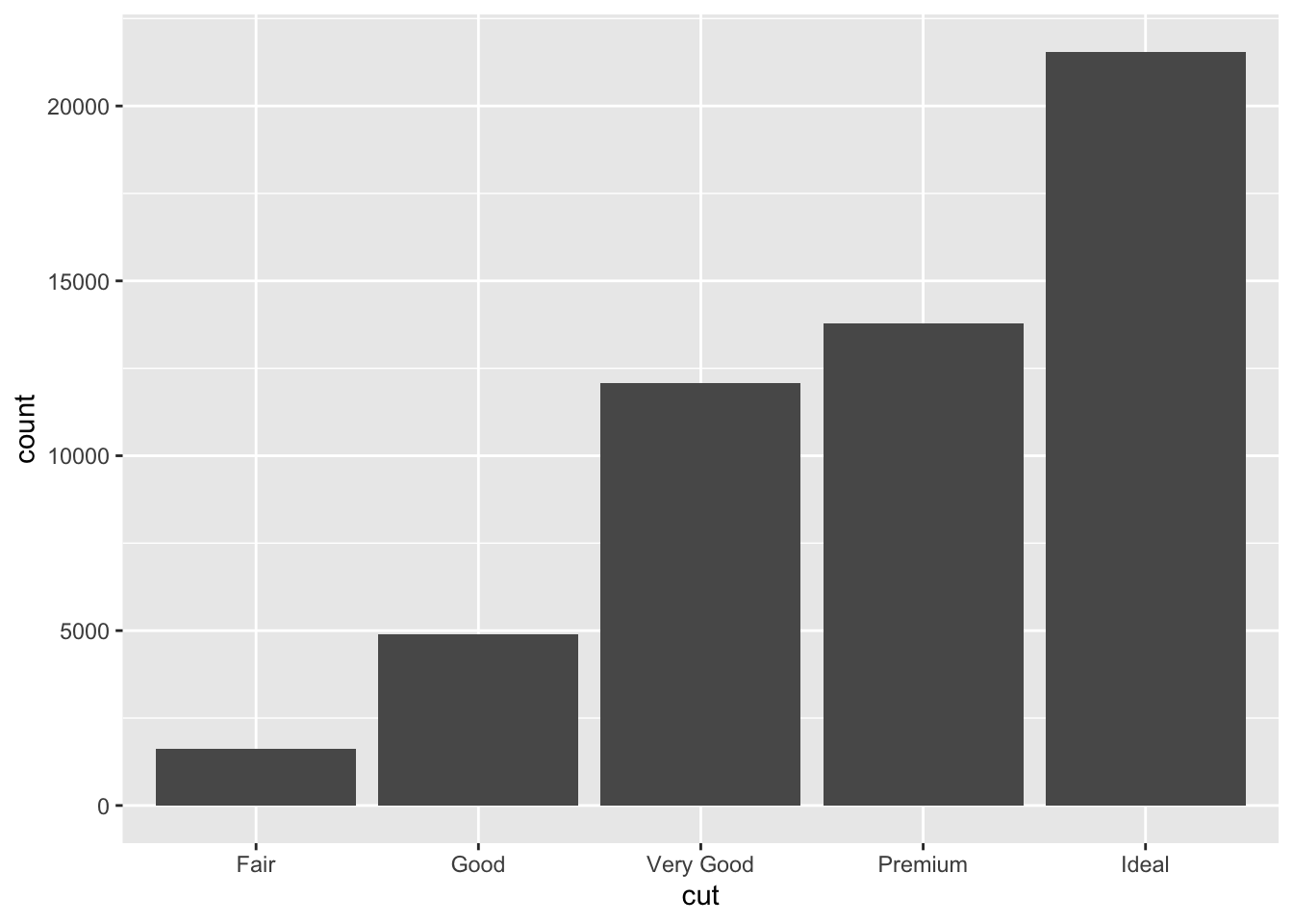
Categorical Variables
Use a bar chart (geom_bar()):
── Attaching core tidyverse packages ──────────────────────── tidyverse 2.0.0 ──
✔ dplyr     1.1.4     ✔ readr     2.1.5
✔ forcats   1.0.0     ✔ stringr   1.5.1
✔ ggplot2   3.5.2     ✔ tibble    3.2.1
✔ lubridate 1.9.4     ✔ tidyr     1.3.1
✔ purrr     1.0.4
── Conflicts ────────────────────────────────────────── tidyverse_conflicts() ──
✖ dplyr::filter() masks stats::filter()
✖ dplyr::lag()    masks stats::lag()
ℹ Use the conflicted package (<http://conflicted.r-lib.org/>) to force all conflicts to become errors
In-Class Exercise 1 – Single Variables
- Plot the distribution of
color using a bar chart.
- Plot a histogram of
price with a binwidth of 1000.
- What patterns or anomalies do you see?
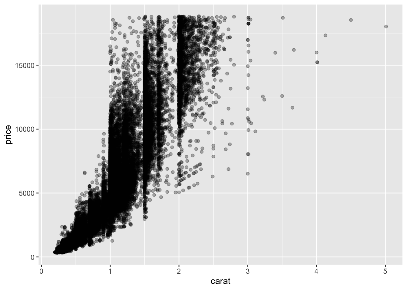
Visualizing Relationships
Two Continuous Variables
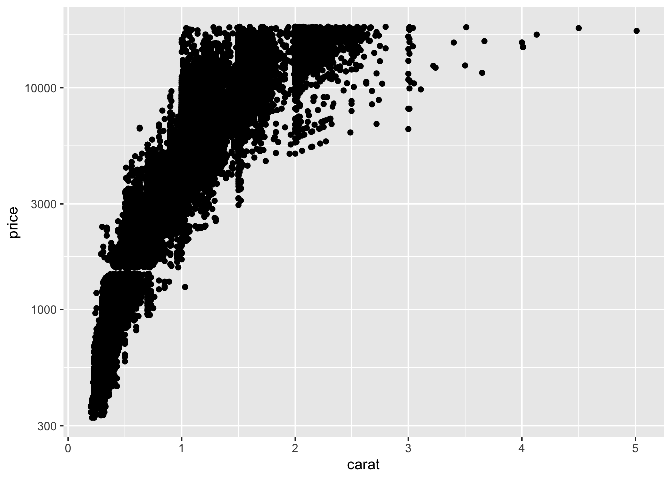
Scatterplots show relationships:
Use alpha to reduce overplotting.
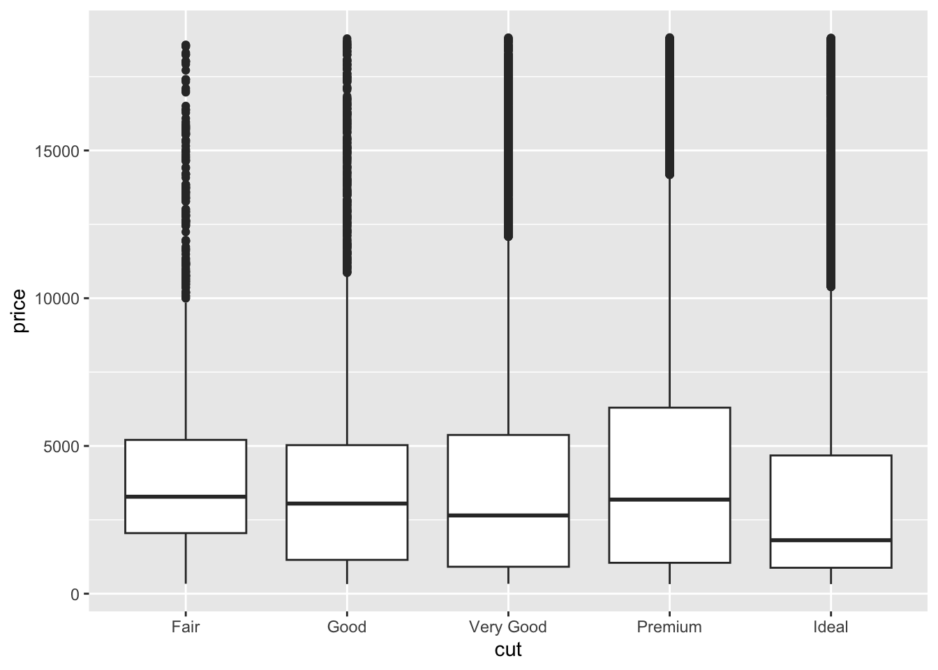
Categorical vs. Continuous
Boxplots work well:
In-Class Exercise 2 – Relationships
- Create a scatterplot of
carat vs price.
- Color the points by
cut.
- Make a boxplot of
price across diamond color categories.
Patterns and Outliers
Look for clusters, gaps, and unusual observations.
You can filter or highlight outliers.
Example: filter diamonds with unusually high price:
# A tibble: 6 × 10
  carat cut       color clarity depth table price     x     y     z
  <dbl> <ord>     <ord> <ord>   <dbl> <dbl> <int> <dbl> <dbl> <dbl>
1  2.29 Premium   I     VS2      60.8    60 18823  8.5   8.47  5.16
2  2    Very Good G     SI1      63.5    56 18818  7.9   7.97  5.04
3  1.51 Ideal     G     IF       61.7    55 18806  7.37  7.41  4.56
4  2.07 Ideal     G     SI2      62.5    55 18804  8.2   8.13  5.11
5  2    Very Good H     SI1      62.8    57 18803  7.95  8     5.01
6  2.29 Premium   I     SI1      61.8    59 18797  8.52  8.45  5.24
Combining EDA with dplyr
Use filter(), mutate(), and group_by() to enhance your plots.
Example: average price per cut:
# A tibble: 5 × 2
  cut       mean_price
  <ord>          <dbl>
1 Fair           4359.
2 Good           3929.
3 Very Good      3982.
4 Premium        4584.
5 Ideal          3458.
In-Class Challenge – EDA Workflow
- Explore
diamonds by:
- Visualizing distributions of at least two variables
- Plotting relationships between two variables
- Detecting outliers
- Applying a transformation to clarify a pattern
Homework Preview
For homework, you will:
- Choose a dataset (e.g.,
diamonds or your own)
- Create at least two univariate visualizations (bar chart, histogram)
- Create at least two bivariate visualizations (scatterplot, boxplot)
- Identify any patterns or outliers and describe them in text
- Apply at least one transformation to improve visualization
- Render to PDF and submit
Next Steps
Next week, we will dive into Tidy Data and learn how to reshape messy datasets using tidyr.